

For this activity during the TeachNow curriculum, we created an infographic. I chose to use the piktochart application.
Check out this site to make your own: https://create.piktochart.com
The process was really interesting, but it was a bit difficult. Below, I’m going to go into the advantages and disadvantages of the assignment. Let’s get into it.
Advantages:
- This was a gorgeous presentation method. I really like the look of my infographic. In addition, you could make many other things like posters and invitations using this site.
- Piktochart was by far the prettiest of the infographic applications. The others had templates, but they had very few adorable images to add. I particularly liked the free themes offered by piktochart.
- The actual assignment was really interesting. We explored demographics, and how demographics in the local and state schools affected standardized test scores. To my shock, some of the demographics even interacted with one another.
Disadvantages:
- The learning curve on the creation of charts (the whole point of an infographic) was a little rough. I usually use Google spreadsheet or Excel spreadsheet to create graphs. This was…hard. There was no tutorial explaining how to construct the graphs that I could find.
- The assignment is super pretty, but I found the limited theme and images due to my free membership maddening. However, I imagine this negative goes away when one pays for the membership. I will say piktochart had the best free options package.
- Occasionally, I would have trouble saving my work.
Overall rating: This was a pretty great application. The final product was fantastic. I learned a lot and this was a creative way to generate a pretty basic set of charts. While I wish there were more free options, piktochart was much better than competing infographic applications in my opinion because of just how polished the final product looks. I also had to do zero adding of plugins or coding, so it’s very user friendly in that sense.


Primary Takeaways from this Assignment
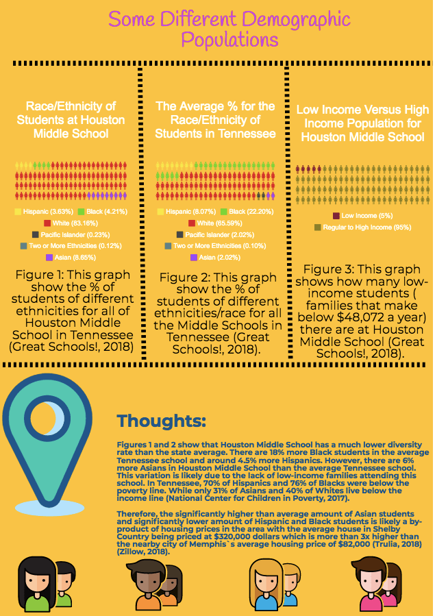
- In both Houston Middle School and the state schools unless the student was of East Asian descent, students labeled as a minority achieved lower standardized TCAP test scores.
- However, this achievement gap was minimized at Houston Middle School to be negligible except in the case of students labeled as black.
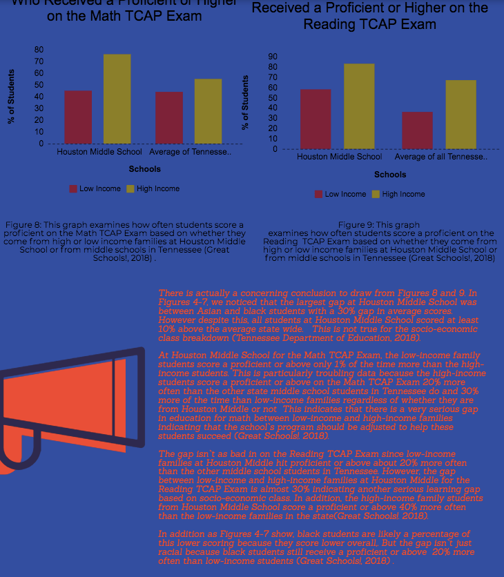
- Socioeconomic class had the largest affect on students at Houston Middle School. Students considered to be from a low-socioeconomic class had the largest achievement gap when the evaluation of the school’s demographic was finished.
- Black students’ TCAP test scores were the most heavily impacted when from a low socioeconomic class.
- Socioeconomic class though had an impact among all the schools in the state. But it had an even more of an impact at the local school we examined. Probably because over 95% of Houston Middle School would be categorized as from a high socioeconomic class.
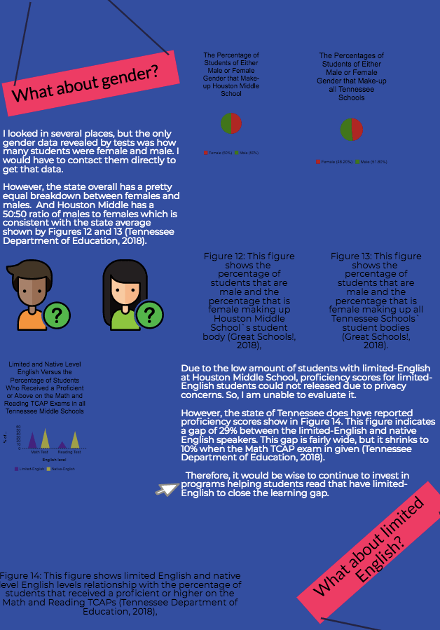
- Gender test score breakdowns weren’t available.
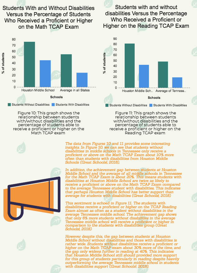
- Special needs students also had a large achievement gap. However, special needs students were twice as high at Houston Middle School as they were state wide.
Final Conclusion: When living in a high socioeconomic area, low socioeconomic class students should receive extra assistance particularly those who are black since they already had slightly lower test scores than their Asian, Hispanic, and white counterparts. Special needs students in the state of Tennessee need additional help as well.

Leave a comment